Appearance
The Browser page looks a lot like the List of Tracks, Albums, Artists, whatever from the iPod Application. It has a header bar with a “Up” button and the “Playing” button, it has a list of items to select from and it has the bottom bar with the shortcut icons.
“Up” Button
That’s the little arrow in the top left corner, named like the level you came from wh n browsing to this page. I don’t call it a “Back” button since it does not act like the one on the browser (in which case it would be redundant). The “Back” button would just get you back to the last page you visited, while the “Up” button gets you to the last page you visited on the level above the current one in the database hierarchy. For Example, if you are browsing playlists one level let’s you choose from your saved lists. The next (lower) level is the playlist itself. Now the playlist may have several pages. If you browse within the playlist to, say, page 3 and press “Back” you get to page 2 wheres when you press “Up” you get to the page you came from in the list of playlists. To make things clear, the Button says where it will lead you.
Title
 The title shows you, where you are in your database, so, if you are browsing an Album, it will state the Title of the Album, if you are browsing Artists, it will say “Artists” and so on.
The List – So much fish and only one beak…
The list of items is where the content of your database is displayed. Depending on the type
of data you are browsing, it comes in two versions, the simple and the complex one.
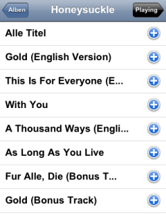
The Simple List
The simple one is used wherever there is only one type of information to be displayed, for example if you browse all the tracks from one Album. Each line in the List gives you the title of a track.
Clicking the List Item
The items in the list are clickable. If you do so you descend to the next level in the database. If you are already on the lowest level of the Database (usually that would be a track display) the item will be started and the “Playing” page will be loaded.
Note: The behavior here differs from SqueezeCenter’s in two ways:
- There is no dedicated “Play” button, instead you click the item.
- If you are playing a track from an Album, a Folder or a Playlist, SqueezeCenter would delete the current playlist, add the single track and play it. iPeng however behaves like iPod: it deletes the current playlist, loads the whole album or folder or playlist and then plays it from the song you clicked on. There is one exceptions: In a folder view that contains tracks as well as subfolders, only the single track is being played (that is due to SqueezeCenter’s behavior to load the whole subtree otherwise).
Clicking the 
Next to your List item, you will find a littl, blue “plus”-sign. This one is different from the normal iPod behavior (in fact you only find it in the “track” view there while editing the on-the-go playlist) but works like the SqueezeCenter “+” instead. It will add that item, or the content of the item (if it’s a folder) to the current playlist.
Again, there’s one exception, and that is Playlists (in Playlist or Folder view). Playlists will have a “Play” icon ( ) next to them since I reckon you will more often try to play them instead of adding them to another playlist. This way you don’t have to descend into the playlist first.
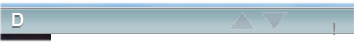
The Page Bar, or the numerical list.
If the number of items on the current level is bigger than the number you allowed for one page in the server settings, there will be a bar on the top and the bottom of the page giving you 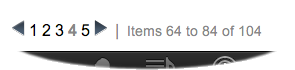 numbered pages to select from as well as two little arrows. You can select a page directly by clicking the page number or go to the previous or next page by clicking the little arrows. The current page will be shown gray.
Note: This does not apply to “Artist” or “Album” views, where you have an alphabet bar, see the next section on the complex list.
The “Top”-Arrow
There’s one arrow left on the bottom of the page.  It’s an upward arrow and clicking it gets you to the top of the page.
The Playlist Control
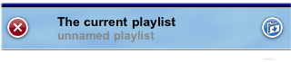
SqueezeCenter always maintains a current playlist. This is where the songs that are currently playing are held. Songs are added with the “+” or the current playlist is replaced with a selection by clicking a play icon, a track or a album cover (see below). As soon as there’s at least one track in the current playlist, the playlist control will show up on the top of the page. It shows the name of the current playlist (if it’s a named one) and have two icons, a red “clear playlist” icon, that does just that: clear the current playlist and a blue “save playlist” icon. If you click the latter, you will get to the PlaylistView, showing all the items in the playlist and allowing you to save it under it’s current (or a new) name.
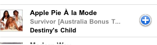
The Ice Field or the Complex List
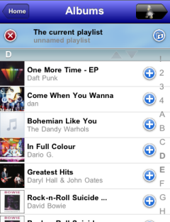 Another view is the complex list. It has all the features of the simple List plus two more. The Complex list is used for the Album view and the playlist view (not yet…) where there is more information to be shown. On the Album View, in addition to the Name of the Album, it gives you the Artist, in Playlist view it gives you the Artist and the Album along with the Track. And it has a cover-art icon to the left of the title.
In most views, the Cover itself is clickable and it’s a “Play” function. When you click it, the current playlist is cleared, the Album is loaded and playing starts with the first song (or a random song if shuffle is on). If you select the Album Title, iPeng will descend and show the album content.
Note: SqueezeBox let’s you click on the Artist as well and switches to Artist view when selecting it. After missing the Album title over and over again with his clumsy wing, Coolio made me erase that functionality. Sometimes less is more…
The Alphabet Bar
At the right side of the list in Album or Artist view, you’ll see a vertical alphabet. This works like the similar list on the iPod application, for the exception of scrolling with the page (you don’t want to pan with wings, bad enough you have to do it on some pages). To compensate for that it repeats itself over and over again, so after “Z” there is an “A” (well, on my list there are some numbers and special characters first, but you get the concept…). Clicking a character will get you to the respective page to the first item with that character. If the section for that character is on the current page, it will immediately bring you to the first item with that character.
Note: You don’t have an alphabet list on the right side but one at the top of the page instead? That’s the backup behavior if the list shown is too short to house all characters of the alphabet. Not much need to scroll anyway with such a short list…
The Alphabet Header
Along with the Alphabet Bar there’s the Alphabet Headers. Alphabet Headers show up between Items starting with different characters (e.g. after the last “A” item and before the first “B” item. In fact it’s these headers that act as an anchor to jump to when clicking the alphabet bar.
Now along with the Character display and the anchor there’s another functionality hidden in the Alphabet Headers, and that’s two tiny arrows that get you to the top or bottom of the page respectively. With these arrows it’s quite fast to get to the bottom bar or the top bar quickly.
The Very Complex List…
Nobody expects the Penguin Inquisition. But here, we got another option…
There are some views, most notably Playlist, Search and Folder View, that show even more details for tracks (only for tracks). This view has everything on a row: 3 lines of text – track title, album title and artist – plus an album cover. In fact, if you’ve got several different artists for a track it can be even more.
Clicking the album cover works as expected. Clicking the row area works as expected, with one exception: now clicking the album title will get you to the track view for that album and clicking the artist will get you to the artist view for that artist.
Now didn’t I elaborate above about why I don’t do that? What do I care about the bullshit I told you yesterday, but seriously: The very complex view is used in cases like “search” and “browse folders” where you might not merely be trying to play a song but more likely are searching for an album, an artist or something, so this gives you the option. And since these are typically not standard “browse” views where you go through lots and lots of items it doesn’t matter if it takes up some more space.
Landscape Mode
Now since iPeng 0.3.9 there’s a new feature for pages with the Complex List: Landscape mode. You can access this by turning your phone or pod by 90° while you are viewing any page that has the complex list (NOT the very complex list, so essentially any view that shows albums).

The Landscape Mode is where Coolio becomes nostalgic, because this is where it all began… It’s a pretty reduced view that only has a small top bar, big cover icons and the alphabet bar. So you can use this to browse artwork.
Also, the usage logic is different. Each artwork has small “play” and “add” icons that can be used to, well, play or add (to the playlist) the album.
If you click the album, a popup will be shown with the album content, this popup then works like the track view of the standard browse page.
If you want to return to the standard view, just rotate back your iPhone/iTouch.
NOTE: iPeng does not detect the orientation but only the orientation change. Thus you will have to be on the album page to activate the landscape more by rotation the device and you have to turn it back there to get back to the “normal” view. If you leave the album page, all other views will show up the normal way.
Now you are done with browsing and we can go on to the sushi…