It has taken a bit longer than expected with App Store reviews and all that, but now iPeng 9, the iOS 9-release of iPeng, is finally available as a free update from iPeng 8/7.
As usual accompanying major iOS releases, iPeng incorporates new platform capabilities and features and prepares to support new hardware.
![]() However, this years new operating system features are so numerous (and the number of supported platforms, too, now that there is also the Apple Watch, and Apple TV and iPad Pro are just around the corner) that we could not implement all new features in one release, so iPeng 9.0 is just the first of several updates that will add new capabilities to iPeng during the coming months.
However, this years new operating system features are so numerous (and the number of supported platforms, too, now that there is also the Apple Watch, and Apple TV and iPad Pro are just around the corner) that we could not implement all new features in one release, so iPeng 9.0 is just the first of several updates that will add new capabilities to iPeng during the coming months.
So what’s new in iPeng 9?
Last year, with iPeng 8, support for the new form factors for iPhone was introduced, which meant most of the changes primarily affected the iPhone.
This year, it’s the iPad that has seen most of the improvements for now, but there will probably be further improvements in later versions for the iPhone, too.
Slide Over and Split View

iOS 9 brings new multitasking capabilities to the iPad, and we think they are especially important for a remote control App like iPeng.
Slide Over
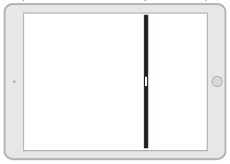
Slide Over – available from iPad Air or iPad mini 2 on – allows you to quickly bring in a second App with a swipe from the right edge of the screen without leaving the App you are in. This can come in really handy for example if you are reading something and you just quickly want to change volume or skip a track. Just swipe from the right edge and select iPeng to be shown in the Slide Over view, make your changes and quickly return to the previous App.
Split View
Split View – available on iPeng mini 4 and iPad Air 2 – goes one step further and allows you to show and use two Apps side-by-side, both occupying a smaller screen space. This way you can permanently have iPeng available next to another App.

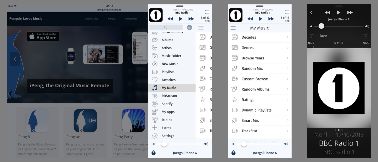
iPeng 9 in Split View
Using the new view modes
In both these new modes, iPeng no longer “owns” the whole screen but has to limit itself to a smaller window. This means, iPeng’s normal layout showing the main menu and the library content side-by-side no longer works, especially in the very narrow Slide Over view.
The solution iPeng uses for this is to slide the content view over the main menu to allow it to use the whole window. You can slide it in and out the same way you can rearrange the views in full-screen mode, too, just that here you will hide the main menu completely when you move the content view to the left.
In addition to this, in this “compact” view, the button arrangement changes on both the main and the NowPlaying screen to still be able to make all functions accessible with less width available.
Activation
One note on swipe gestures: Swiping from the right screen edge used to be the gesture to bring in the current playlist in iPeng for iPad. Now this is also being used to bring in a Slide Over view. The solution is that the Slide Over gesture will work in the (vertical) center of the screen while you can bring in the playlist by using the same gesture near the top or bottom of the screen.
iPad Pro
The new flexibility with regards to screen sizes becomes especially apparent on Apple’s upcoming next iPad model: the iPad Pro. On the iPad Pro, two Apps can run side-by-side in landscape mode and have almost the same size as on smaller iPad models in portrait mode. Or, if you run iPeng in full screen, you have even more space to show your library content – actually so much space that on the iPad Pro iPeng will allow you to permanently show the current playlist (“pin” it to the main screen), not only in landscape but also in portrait orientation.
iPeng uses a new font
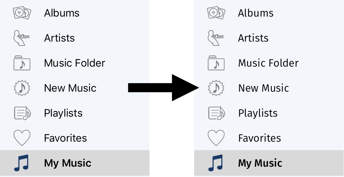
iPeng 9 also introduces a new font to iPeng: Fira Sans. It gives iPeng a more distinguished look compared to the system font, but it also serves a practical purpose:
With iOS 9 Apple switches to a new system font called “San Francisco”. San Francisco was designed to offer better legibility at small point sizes (short text height), but it does so at the expense of greater width, at least for small sizes.
This is great if you want to display blocks of text on the screen, like for a reader or browser App, because you can get more lines on the screen and still have a well legible text, the few characters less you can show per row are typically less important.
iPeng, however, often shows single lines of text that are width-limited while the height of a row became less important in the light of devices getting bigger. For this reason, we wanted a font that is narrower but taller, trading height for width, and we wanted it to be at least as legible as Apple’s font.
What we found as a solution was Fira Sans, the font developed by Carrois and Edenspiekermann for the Mozilla Foundation.

While technically a sans-serif font, Fira Sans has some visual guides that improve legibility for narrow text and has a relatively small width, allowing us to increase the point size of the font while still displaying the same number of characters in a row.
This way, iPeng achieves improved legibility without sacrificing content.
Watch out for more news in iPeng
These are the major changes for now, but iOS 9, watchOS 2 and upcoming tvOS have much more to offer, so watch out for more new features and iPeng variants in the next months…
Have fun with iPeng!