Back for a cool time in spring: iPeng 0.4 is out and comes with a icebreaker load full of changes and improvements.
Coolio did lots of testing and bitching about details, so a lot has changed. Also, Coolio convinced Erland Isaksson (he’s really sympathetic to people from those cool countries) to write him a a supporting plugin that opens up a strait to plenty of new features.
So what has changed?
First of all: iPeng is no longer a skin, but a plugin. Apart from having to be installed in a different directory, that gives the opportunity for localizations, so iPeng menus and strings can be translated. Right now, it only has English and German localizations, but we’re happy to admit translations in other languages ;-
Being a plugin, there can also be configuration options, and they are used to support two distinguishing features iPeng 0.4 provides: NowPlaying plugins and configurable toolbars.
Configurable Toolbars
Configurable toolbars: There was lots of feedback of the kind: “Can’t I get a Search button, New Music button, whatever button on the toolbar?” Now iPeng let’s you configure these yourself, comes with a variety of additional buttons, allows plugins to register their own buttons plus allows you to define your own by means of a simple xml file logic. So anything that can be reached in iPeng through the CLI, JavaScript or a URL can be put on a toolbar button!
Just to give a small example: the “Player control” toolbar that would mimic the NowPlaying screen toolbar:

Toolbars can be context specific, so a plugin could offer commands, that only make sense within the context of the plugin. One example for this are the “home” screen commands (Internet Radio, Alarm, Sleep) that get you directly to the respective page on the home screen but are not available from other screens.
NowPlaying Screen
Another part that has been completely reworked, is the “NowPlaying” screen. Most of this will go unnoticed, but some features are quite prominent:
The Swipe
Former versions of iPeng had a little button in the top right corner of the NowPlaying screen to switch between the cover art view and the playlist view. Now, there’s a page indicator instead that shows you where you are since it’s no longer only two pages that can be used on NowPlaying screen:

Now, theoretically you can click on each of the dots to go directly to one of those pages, and actually that’s what you will have to do when using iPeng on a PC or a Mac, on iPhone iTouch, however, there’s a more elegant way: just swpie the page to the left or the right to change back and forth like browsing through a book. A feature not seen before on iPhone webapps.
The Plugin Screen
What made this necessary, was the plugin screen. You reach it with a right swipe and it is a way to let plugins add NowPlaying specific commands and information. If it’s information, it will be shown in another (fourth) page. And the best thing is, these pages get updated depending on context, so they can be used to show track specific information.
An example, that comes with iPeng is the SongInfo Command. It shows the SongInfo details presented by the other skins upon clicking a track.
Other examples that come with iPeng 0.4 but require external plugins are Biography (shows the Bio of the artist for the current track), Album Info (same for Album Info) and MusicIP (creates a MusicIP mix based on the current track).
More will be available shortly with upcoming releases of Erland’s CustomBrowse plugin.
The Landscape Mode
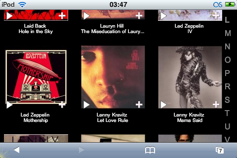
Another feature tried out in the experimental versions of iPeng 0.3x that now comes with 0.4 is the landscape mode. While browsing an album view (that is: one that has cover art), just turn your iPhone to the side and it will re-load the page with big artwork in a landscape layout.
Note: This is somewhat of a gimmick, it will take much longer to load than the standard scree due to the large artwork. Also, the album view will have to be loaded to switch, so moving your iPhone while the screen still loads or while you are on another scree will not result in the desired effect.

Other Changes
Apart from this there is a load of other changes:
- The Start screen now aggregates Internet Radio and MusicServices into one Menu Item. This is something I did for Coolio who just wouldn’t learn the difference and always try to look up station in the wrong menu first
- If you use CustomBrowse it does the same to Music Library and Browse more and shows CustomBrowse on the Main Page instead.
- RandomPlay is now supported
- The Browse Pages now do not cut filenames by themselves but use iPhone’s browser feature for this, so you will no longer end up with filenames that were cut short even though there was still space left in the row.
- BrowsePages use AjaxUpdate to load the next page so you will not end up seeing an empty load page while waiting for the next page to show up but stay on the current page.
- Numerous details improvements and bug fixes.
Have fun!