A device like the Apple Watch brings new challenges for the app design, especially considering the limitations Apple’s current WatchKit has. Communication with the watch is not very fast and consumes a lot of battery power and since apps run on the iPhone, not the watch, every piece of information needs to go back and forth. So uploading long lists and the like or permanent remote communication right now don’t look like a good idea.
 Also, there is a fixed and small set of user interface elements one can use on the Watch. This is a pity, particularly when it comes to the volume buttons. Ideally, one would want to use the crown to change volume, but currently that’s not possible.
So browsing through long lists of thousands of albums or the like will probably not make sense (Apple’s own apps are all quite limited in that respect), Apple’s general guideline is to only implement tasks that don’t take longer than 10s since after that the arm will quickly start to tire.
iPeng tries to find the sweet spot in between these limitations with its current design, here are a few design features:
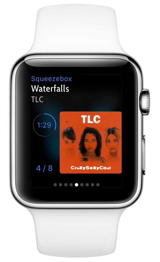
Glance as Entry Point
Navigating the honeycomb home screen is complicated and takes time. The easier way to launch an app is through a glance. iPeng’s glance shows you a “NowPlaying” screen, tapping it takes you to the app.
Currently, WatchKit glances can’t contain any active elements, so there are no buttons or other controls even though we would love to be able to have them.
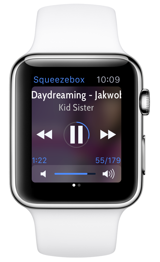
Scrolling Track Titles with Custom Font
Apple’s system font on the watch is optimized for legibility at small font sizes. You can get a maximum number of (legible) rows on the display this way, but it’s not the optimum solution if – like in iPeng’s case – all you want to display are one or two rows of track title and that quickly exceeds the width of the display. So iPeng uses a different font with a smaller run width and uses a bigger character size instead.

To be able to show longer titles, the title label scrolls.
Page-Based Layout
iPeng uses a page-based layout, not a hierarchical menu structure. This is familiar from the layout of the “NowPlaying” screen on iPhone, but on the Apple Watch it’s actually a more important decision. Page-based apps cannot have a hierarchical menu like the main menu on iPhone, so that option is no longer available for additional functionality (like search). But a hierarchical structure would have meant that it takes longer to get to the “NowPlaying” screen – not a good idea for a functionality you are probably going to use 90% of the time.
iPeng places the most important features right in front even if it means less often used features might be more difficult to access.
Speed
iPeng will sometimes trade perfect information for speed of access. On iPhone, iPeng will keep a permanent connection to the server, allowing iPeng to track a lot of states and always be aware of what’s going on with your Squeezeboxes. But establishing this connection takes seven seconds on average. Add a few seconds for the app launch and you end up with a time well in excess of the overall time you wanted to interact at all. So iPeng on the watch will always try to use the quickest way to access information or execute a command. Sometimes this means some information is limited or updates later (e.g. artwork), but at the same time it means it’s probably the fastest remote control app you’ve got around.
The Future
The Apple Watch is a very new product, we will see how it evolves in the future and what kind of usage schemes evolve, but right now I believe iPeng is giving you a really good UI for the quick control of your players on your wrist.
Apple also already announced watchOS 2.0 for this fall and it brings some changes, the most important of which is that Apps will actually run on the Watch, not the iPhone. This will probably help with performance for some features but might even hurt for others (everything requiring direct communication with the parent App on the iPhone will actually take longer to execute). Overall, I would not expect the biggest impact to be through faster loading times and access to the crown.