
Dear friends of iPeng. The iPhone 5 has brought a new form factor to the iPhone/iPod world, and we have used the opportunity to give iPeng a complete UI refresh. It’s been two years since the last UI change, and during that time, App user experiences have changed a lot so we felt it was time for some fresh air.
![]()

So what’s new?
1. Design
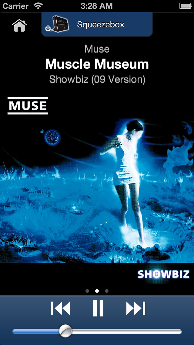
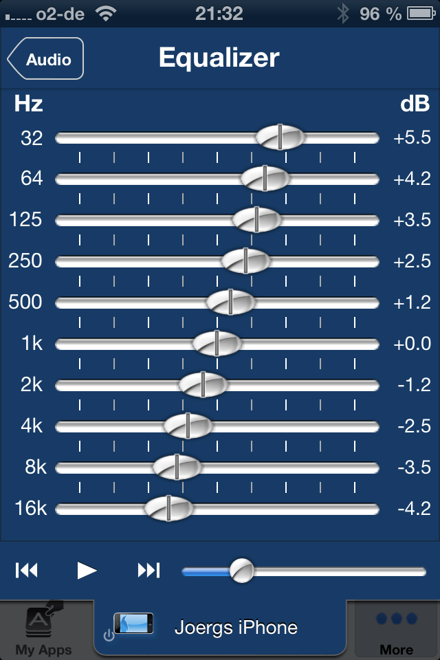
First of all, iPeng’s graphics are now drawn much cleaner, they use more contrast and we tried to give iPeng a more reduced, less playful look, taking away a lot of gradients, semi-transparent elements and colors. This improves readability, makes iPeng’s screens look less crowded and in some places it has freed up some space to make elements bigger and more readable, like the title information on NowPlaying. Besides that the NowPlaying screen is now optimized for iPhone 5 but also looks cleaner and more readable on the older Apple devices.

We also payed some additional attention to icons, so now the main menu icons are all available in retina format and the player icons now again use real images of the devices they represent, similar to the ones used in iPeng for iPad.
2. Usability
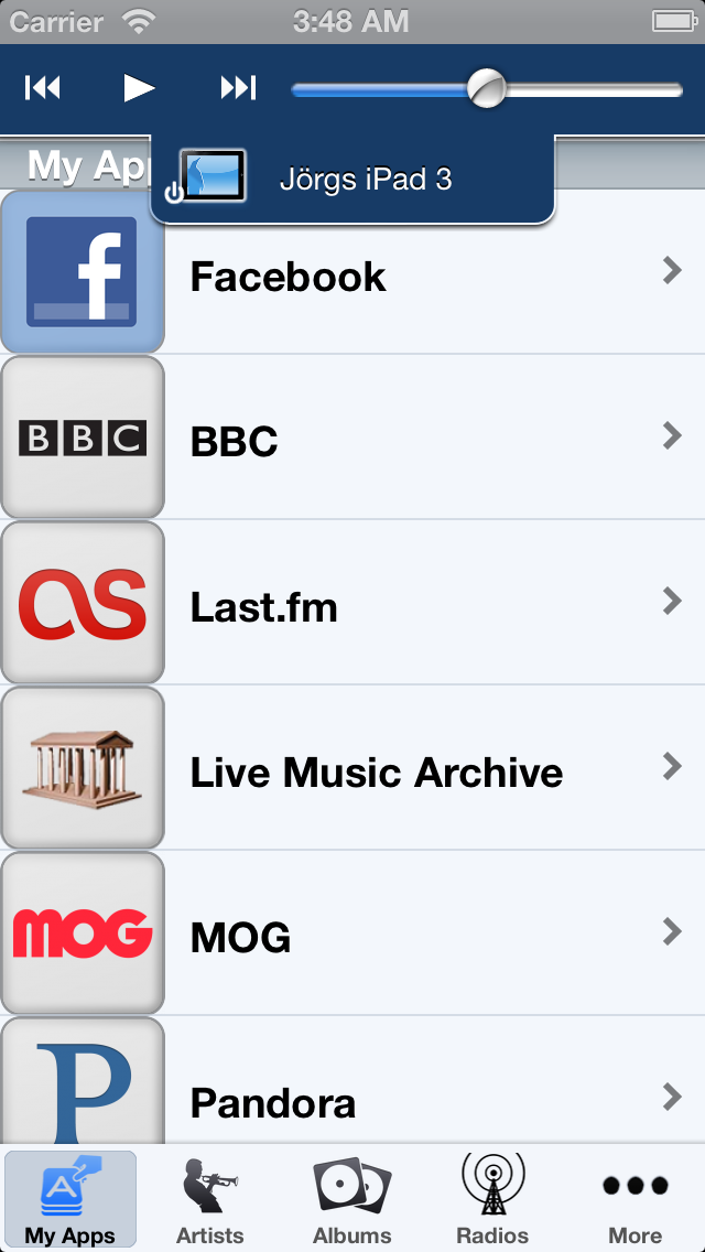
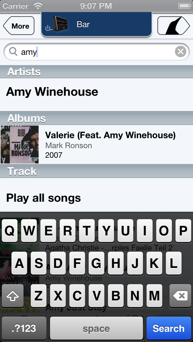
iPeng 2.0 now has a new player-tab at the top of the screen that always shows you which player you are controlling and also gives you quick access to the list of players and Music Sources (MultiPlayer control) from everywhere in the App.
It also contains shortcuts to control the current player without having to switch to NowPlaying.
We believe that this will significantly improve the accessibility of often-used features in iPeng and therefore make your iPeng user experience even better.
3. Features
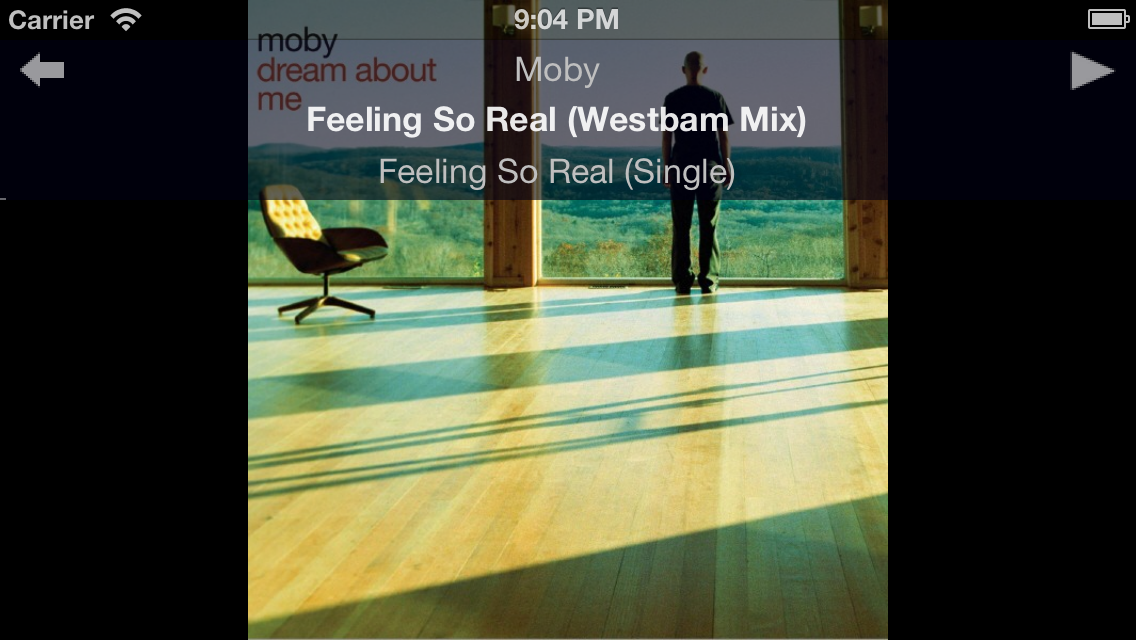
The space freed up on the left-hand side of the NowPlaying screen is now filled by the same Lyrics screen saver that’s also featured in iPeng for iPad.
The Changes in Detail
Design Language
iPeng’s new design language distinguishes between three different functional areas in the App.
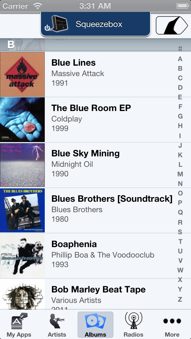
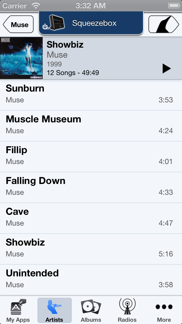
- The Library View
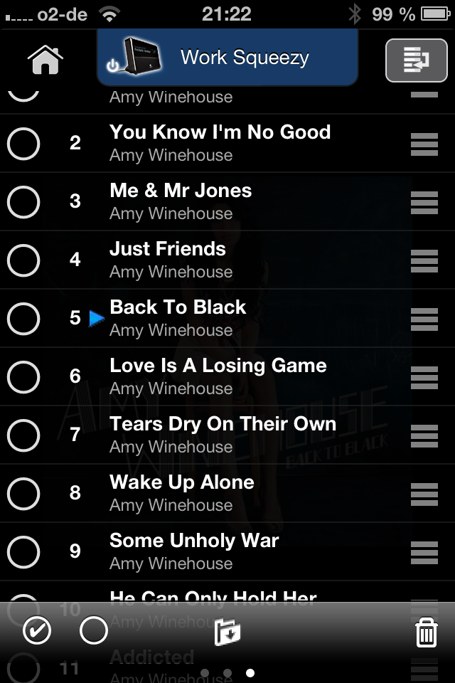
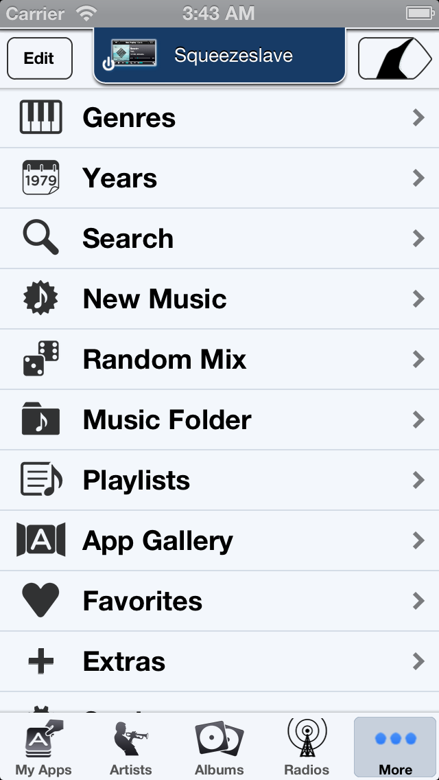
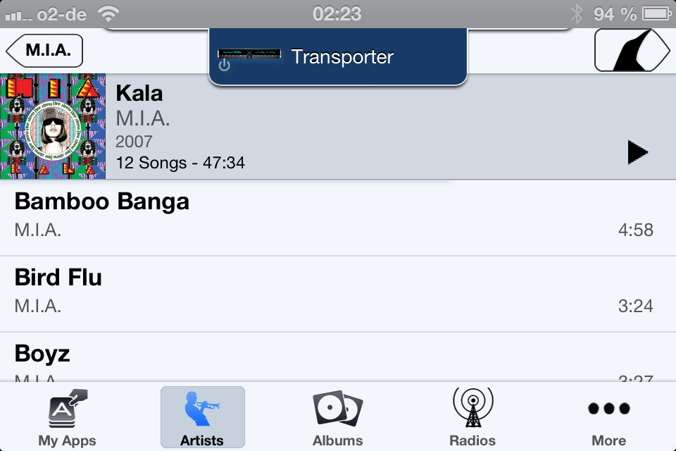
 , or main menu, with a light background resembling the pages in a book shows all the content you can play with iPeng. It has your Albums, Artist etc. as well as access to music services like Spotify, Pandora or Internet Radio. It preserves iPeng’s existing layout and menu structure but draws the information cleaner and in a better structured way and it also gives you more details for example for albums and playlists.
And it preserves iPeng’s unrivalled simplicity for building current playlists by use of it’s “play modes” feature.
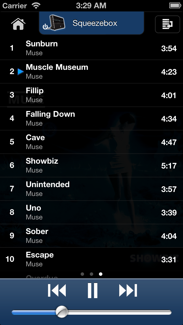
- The NowPlaying Screen
 with a black background shows you what’s currently playing and hosts the main player controls The black background is being used to distract as little as possible from the actual music information and allows for maximum contrast to make your music’s cover art look great.
And the bigger, scrolling labels for artist, album and title of the current song are much more readable than before
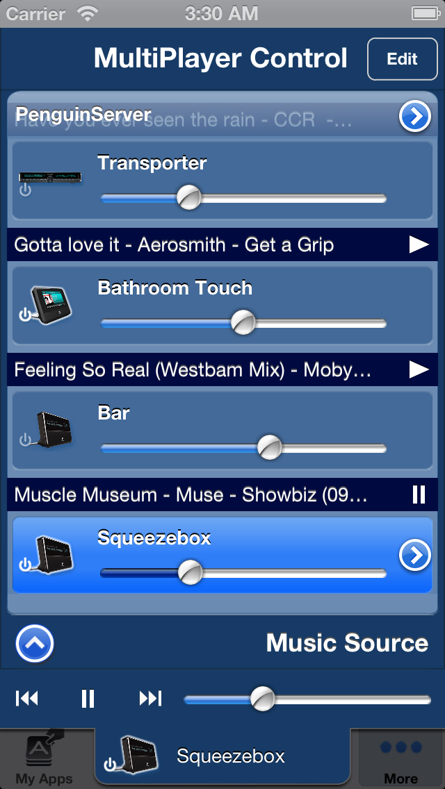
- The MultiPlayer Control
 in blue shows your players and lets you manage as well as control them right in place. This control now looks like in iPeng for iPad but is functionally unchanged over iPeng 1.x, it just shows in a different place.
The same color is being used for the main player controls on NowPlaying and their duplicate in the MultiPlayer control.
User Interface Concept
Besides the design changes, the most significant difference between iPeng 1 and 2 is in the way the player selection and player settings are being handled. In iPeng 1.x, the list of players and music sources was limited to the NowPlaying page and resided on a sub-page that you could slide in from the left. This had the advantage that it was very easy to switch between players and to immediately see the music they were playing, while at the same time it didn’t take up valuable space in the main user interface.
However, it also meant that you could only access the player through the NowPlaying screen and that this was also the place you had to turn to look up which player you are actually controlling.
This is changes as of iPeng 2.0. iPeng 2.0 now always (with the exception of the landscape NowPlaying screen-saver) shows the current player at the top of the screen in a special tab and this tab also gives you access to the main player controls as well as the list of players and music sources (MultiPlayer control). You can tap or drag that tab to switch the MultiPlayer control up and down.
And you can just drag it down a little bit or double-tap it to expose a copy of the main player controls for play/pause, track skipping and volume. They will then hide the title bar buttons, but iPeng still offers you full menu navigation through left- and right swiping gestures to go back or to switch to NowPlaying respectively.
New Gestures
And last but not least, iPeng has learned a few new gestures. You can scale the artwork on the NowPlaying screens (except for portrait on iPhone 5, where it’s always set to “big”) and you can skip to the previous/next track from the landscape NowPlaying screen-saver through right/left swiping gestures.
We hope that all of these changes really help to improve your user experience and that you continue to have lots of fun with your iPeng!